5 ways to improve your product's UX without a designer
The learning curve to designing pixel perfect UI isn't a short one but the mindset that a UX/UI designer applies everyday is something anyone can start doing today.
Making digital products be easy to use ins't rocket science, yet I'm surprised to hear loves ones and friends frequently complain how tough it is to use a certain app at work or in their every day lives.
As a UX designer what we do is make apps and websites delightful to use. This entails merging skills that come from graphic design, cognitive psychology and business. While most startup founders associate a UX/UI designers work to making beautiful designs on Figma or Adobe XD, our work shines outside of design software and in how we as UX designers think and make decisions.
The learning curve to designing pixel perfect UI isn't a short one but the mindset that a UX designer applies everyday is something anyone can start doing today.
This article is for non-designers to help them improve their work, without having to move a single pixel.
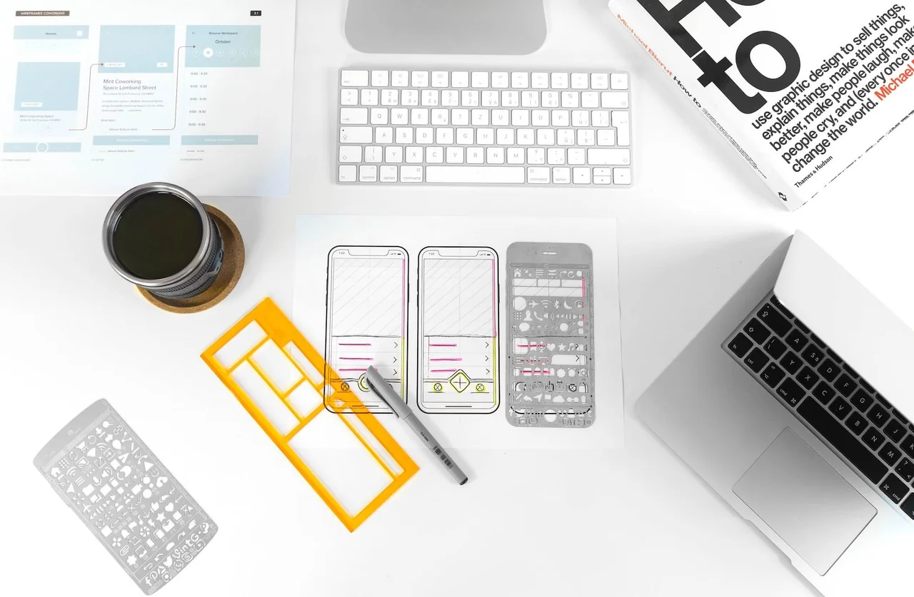
Design on paper
When wanting to solve a design problem, the first thing we tend to do is to go directly to Figma, Adobe XD or Powerpoint and mock up our idea there. The minute we are presented with the opportunity to make something beautiful the battle is lost and we will go into tunnel vision. The cheapest and easiest way to prevent tunnel vision is to forget designing on Figma and make a rough pen & paper sketch of what you have in mind. The uglier the sketch the bad ass you are. Perfectionism can be the cancer of innovation and getting comfortable making ugly sketches of what you have in mind is I think one of the world's most underrated skills.
So next time you are debating how a new feature could look or work, draw it on paper, take a picture of it and explain it with a Loom video.
Look for references
When solving a design problem a UX designer should first diverge to get as many insights as possible and then at a certain point converge into a solution to that problem. The mistake we all commonly make is to make diverge phase, which is crucial for insight generation as quick as possible and immediately jump into Figma to start designing. This again causes tunnel vision. An easy way to prevent this is to always look for at least 3 references to the problem we are trying to solve. These references can be direct competitors or solutions in completely different markets. Take a screenshot of each reference and have somewhere close by.
In my workflow whenever I start to design I upload the pictures of my references and wrap them in a section called "References" so I can easily go back to them at any point and also share with my team where my insights are coming from.
Do a 5 second tests
From years of refining Teamscope my previous startup and working with countless of startups around the world I can conclude the following: founders tend to over prioritise aesthetics. They compare themselves with companies that have teams of senior visual designers and millions in capital raises and they want to look like them. At the same time, users are much more forgiving on visuals and have higher expectations on a product's usability.
When all of the focus is put on aesthetics that comes at the expense of usability.
The landing page might look beautiful and logo super slick but the apps UX sucks and all that effort on making a product beautiful is gone to waste.
To prevent this I highly recommend design teams to be continuously doing usability tests, my favourites are: "5 second test" and "First click test". For this you can use Useberry which offers a free plan to launch these tests with real users today.
In a 5 second test you show a design to person for just 5 seconds and then you ask them "what do they remember?" and "what would they improve about this design?".
On the other hand, in a "First click test" you show a design to user and ask them where would they click on it to do a certain action. A first click test generates a heatmap of where users are clicking and most importantly average time it's taking users to make the click.
You can use these simple usability tests to validate whether people easily understand what your product does and who is it for or also to easily test new feature designs.
Record first impressions with Loom
According to a study by Intercom between 40% to 60% of users that signup to a product never return. The only way to tackle that problem is put focus on the first impression that your product is giving users when they sign up for the first time.
My favourite way to get first impressions insights is with a screen recording. With every new client before I've used their product I'll record my first impressions with Loom and narrate everything that catches my attention. Loom is a screen recording app that makes it very easy to record your screen and share it with others.
Try it out yourself, ask 5 people that have never used your product to record their first impressions with a Loom video, encourage them to narrate as they are doing so all of the things that come to their mind. The insights you can get from those recording may be the solution to why some of your clients are signup but sadly never coming back.
Build a panel of user ambassadors
With every new product or feature we develop there is the risk to deliver something that was off target. The only way to mitigate that risk is to be in contact with clients in an ongoing basis. If a product or feature takes us two months to build and during that time we weren't interfacing we are at risk that those two months are wasted time and resources.
Make the habit of interviewing at least one user per week and in those interviews probe for:
- What has been for them their biggest pain point in the last few weeks?
- What ever pain point they bring up, how critical is it for them?
- What would be the ideal solution to that problem for them?
You can reward these valuable users for their on going feedback with symbolic things like company t-shirt or stickers or with gift cards. At any rate, make sure you build a panel of user ambassadors since their feedback is where the millions dollar insights come from.
Conclusion
What make a designer ins't the tools they use but how they think and solve problems. While making beautiful interfaces maybe a long learning curve, everyone can think like a designer. For startup founders this may mean the difference between shipping a product that users will love or another solution that ends up in the startup graveyard.
In this post I've shared 5 tactics any startup founder can implement today to considerably improve their products user experience without having to spend countless hours on Figma.
If you feel you need more help with product design or your are looking for a UX/UI designer, I'm available 👋